 Ghent, Lore Van den Bossche - How can we successfully visualise the language industry and capture it in images? Indeed, this is the very question that I tried to answer during my internship at De Taalsector/The Language Industry.
It is, in fact, a relevant question, because the language industry is not nearly as visible as other more mature industries. The doctor has his stethoscope, the judge his gavel and the cook his chef’s hat, so how can we make sure that language professionals and language professions become just as visible? The idea behind this project is that everyone who is part of the language industry should be able to benefit from a strong image, including an attractive visual.
During my internship, I tried, then, to capture the language industry in all its diversity in a beautiful, comprehensive and versatile image in order to initiate a debate: a challenging project, it seemed.
My first task was to discover how language professionals make themselves visible and which images they use, then to find out exactly what image the general public and the demand side of the market see. Next, I began to look for inspiration for a new image and finally, I put the brand-new image down on paper.
Step 1: which images do language professionals use to make themselves more visible?
 Language companies and language professionals tend to use the same recognisable images on their websites and social media pages. We could say they are stereotypical. The world map and the globe are by far the most common images. Pictures of (capital) cities and national flags are very popular, as is the keyboard with its translate key, dictionaries, pen and paper. The websites of translation agencies and language course providers mainly show stock photos of intensely happy, hard-working business people and children smiling.
There are some companies, however, that visibly try not to portray themselves using these stereotypical images and stock photos. Belgian translation agencies Atrado and Nevero, for example, show their own team in their own working environment. To me, these images are much more dynamic because of that personal touch.
Step 2: how does the general public perceive the language professional?
Which images do the general public and potential client perceive when they think about language professions, such as the translator, interpreter, editor or copywriter, etc.? Are they the same images language professionals and language companies use to portray themselves? Or are they completely different?
 To find out, I carried out a short survey among the general public in Belgium. As it is impossible to survey the entire general public, I called a selection of graphic designers and photographers, thinking that they would be able quickly and spontaneously to tell me which images they see. They described the translator as someone at their desk, often behind a computer with a text on the screen or surrounded by dictionaries. The interpreter was associated with someone translating in parliament, or just a couple of people talking.
It was clear that some respondents did not know the difference between a translator and an interpreter: they visualised a translator as a conference interpreter or associated an interpreter with a large piece of text. The computer and text were associated with the editor and the copywriter. Language work in general evoked images of dictionaries, flags, letters and text.
To find out whether these images were associated with the language professions in other countries (and because I study English and Portuguese), I also surveyed a similar selection of graphic designers and photographers in England and Portugal. Were the images very different? No, the language professions evoked the same images.
Step 3: searching for a new image
I did not just want to look at standard pictures during my internship, I wanted to create a new image. This was the reason why I began to seek out an image that would capture the language sector in all its diversity.
I found inspiration in the language sector’s philosophy, the images I collected in phase 1, an event at the University of Antwerp for language teachers, Facebook, SMAK (City Museum for Contemporary Art), De Taalsector/The Language Industry's existing logo and the world around me.
De Taalsector/The Language Industry sees the mind develop in the direction of a true language industry where language professionals can look beyond the borders of their own segments and work together.
The images I collected in step 1 may be stereotypical, but they are recognisable. In that sense, I found it useful to recycle those images. 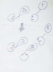 The UA Taaldag (“Language Day”) at the University of Antwerp (30 January, 2016) was an opportunity for inspiration from a different cross-section of language professionals, namely 250 language teachers. We handed out flyers at De Taalsector/The Language Industry exhibition stand, asking them what images certain language professions called to mind: a teacher of Dutch as a second language, an English teacher, a dialectologist, a terminologist, a copywriter, an interpreter, for example. We even got a drawing out of the event.
On the Belgian version of De Taalsector/The Language Industry's Facebook Page, we asked language professionals which images they see when they think of certain language professions. 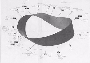 This search for inspiration provided an abundance of images, analogies and metaphors, but I still wanted to be artistically inspired. This was the reason why we went to SMAK (City Museum for Contemporary Art) in Ghent, Belgium, where we saw Alexandre Singh’s drawing, which is part of an installation called ‘The Pledge’. His work shows a floating band attracting small images and (handwritten) pieces of text.
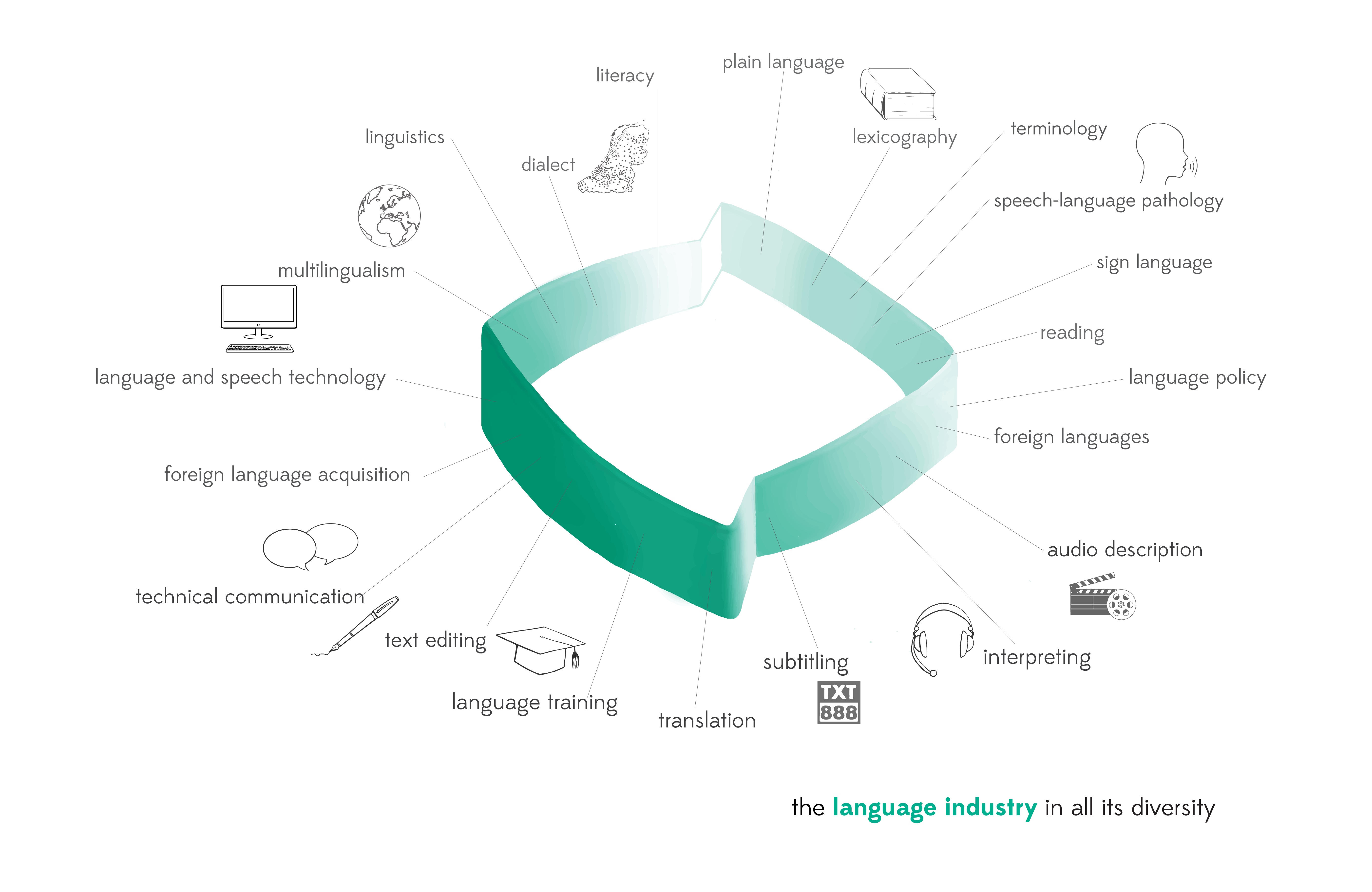
  Lastly, De Taalsector/The Language Industry's existing logo served as an inspiration. What if we gave the logo a 3D makeover?
Step 4: a new image
After looking for inspiration and plenty of brainstorming, I got to work with pencil, paper and graphic tablet. De Taalsector/The Language Industry's logo got a 3D makeover, which was recognisable and in line with its philosophy. The images I had already collected found their place around the new image. This was how I eventually found my image, capturing an industry with a wide range of segments, which has a strong bond, but is still open and in interaction with society. It is a dynamic image and there is still room for more diversity: new language professions and – who knows – new segments.
This is an image that shows the industry in all its diversity. And that was the challenge.
What about you? What do you think of the image?
Can you suggest anything to make it even more powerful and attractive? Or do you have any creative ideas for visualising the language industry, language work and language professions?
Leave a comment or send me an email: